Client: StorKom
Project Type: Naming & Brand Identity
A cold chain company that links two countries needed a name and a mark that point forward.
The company
StorKom is a third-party logistics (3PL) and cold chain provider based in Sitra, Bahrain. It runs temperature-controlled warehousing, transport and distribution across Bahrain and Saudi Arabia.
The company grew out of Shell Logistics nearly 30 years ago and works as a cross-border supply chain hub between the two countries. New distribution projects inside Saudi Arabia now extend its temperature-controlled logistics across the MENA region.

The name and the logo
My work started with the name. The company was renamed, and the new name was designed as a logotype in which the K is inverted to form an arrow: a sign of openness, reach and forward thinking.
The green stands for a green path. In Arabic culture, wishing someone a green path means wishing them a safe journey.
The arrow K and the green carry across the fleet, the warehouses and the uniforms.
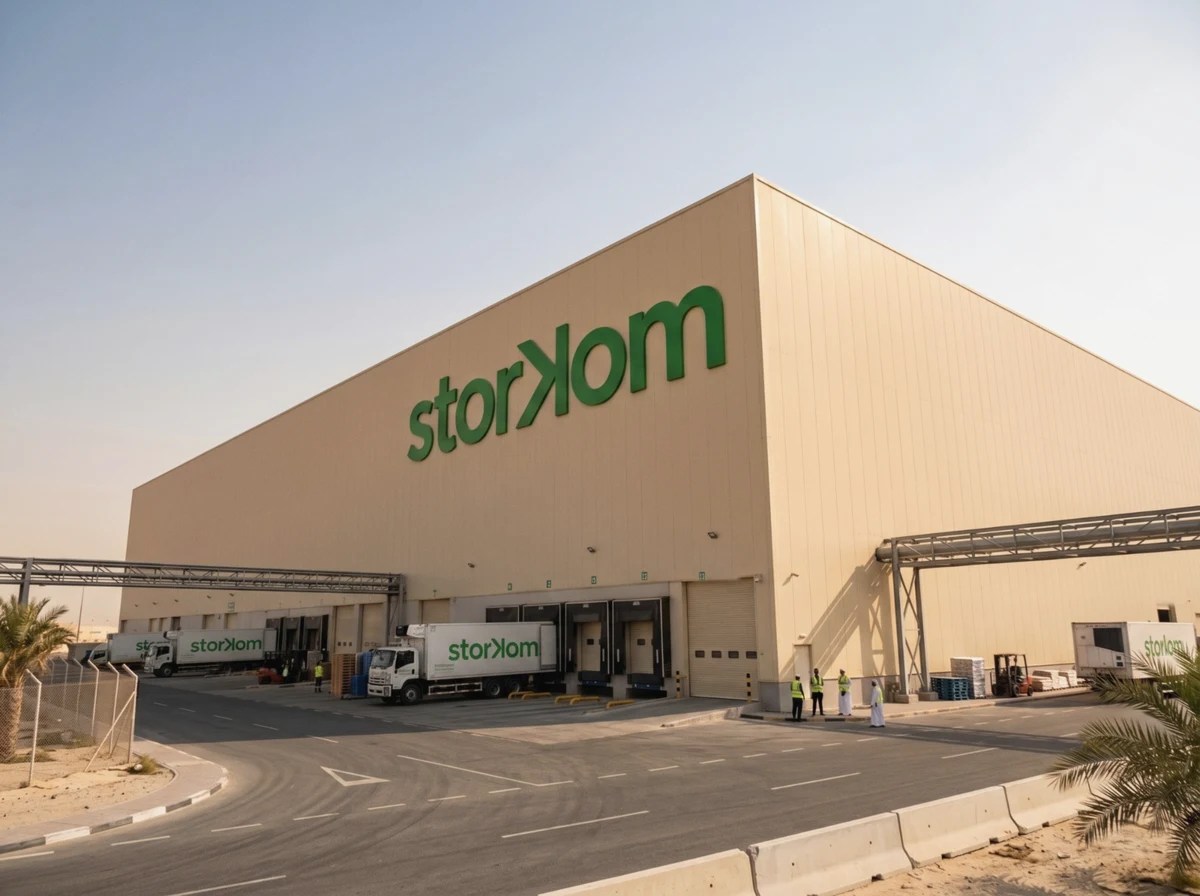

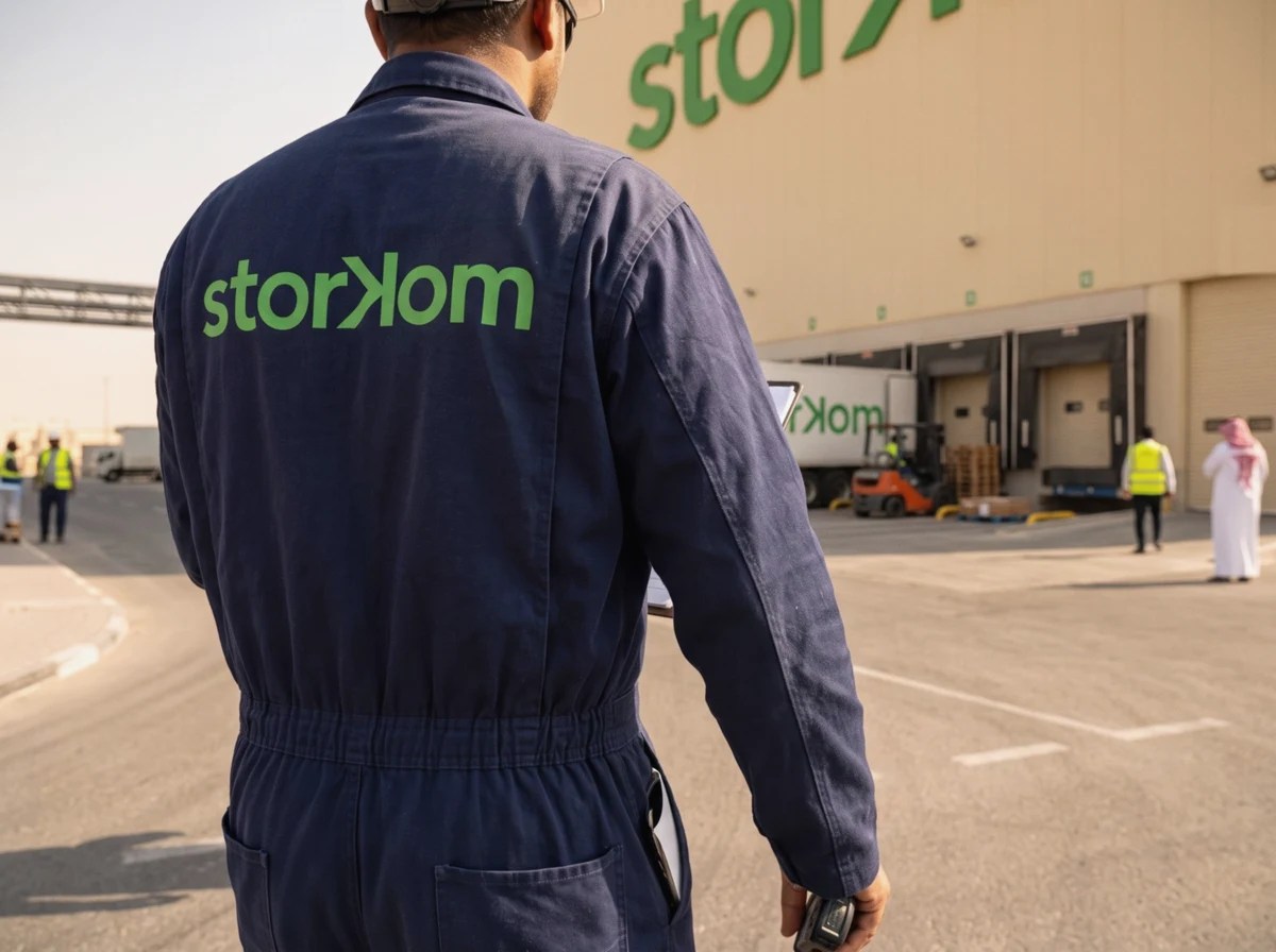
Brand application visuals.
As StorKom puts it on its website: “The StorKom brand identity reflects its position as a modern, cross-border powerhouse in Middle Eastern cold chain logistics. It bridges a legacy of multi-decade reliability with a highly tech-driven approach to regional supply chains.”