Client: Sabon Sana
Project Type: Brand Identity
Handmade soap deserves a name that feels handmade too.
The workshop
Sabon Sana is an artisan soap workshop with a wide range of innovative handmade products: scented soap, scented oil, body oil, body scrubs and more.
The logo
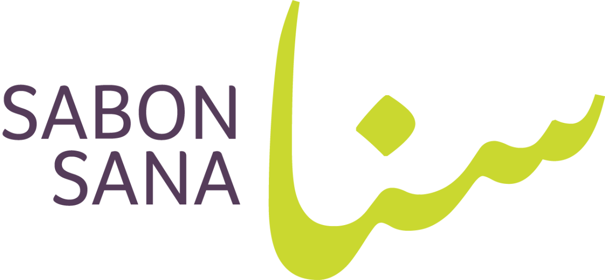
The logo pairs Arabic calligraphy with English type. Sabon is the Arabic word for soap, written in English letters, so the name reads across both languages.
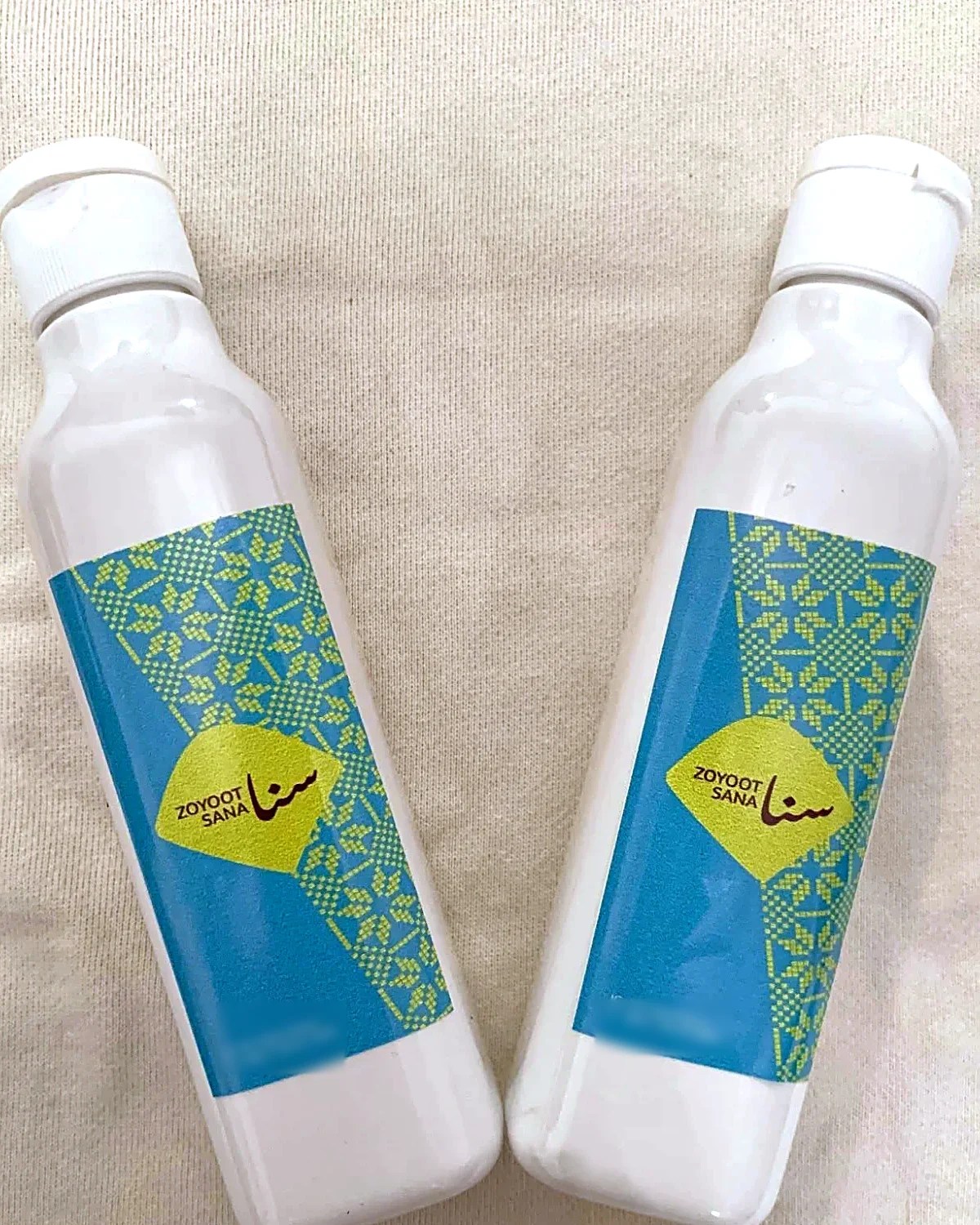
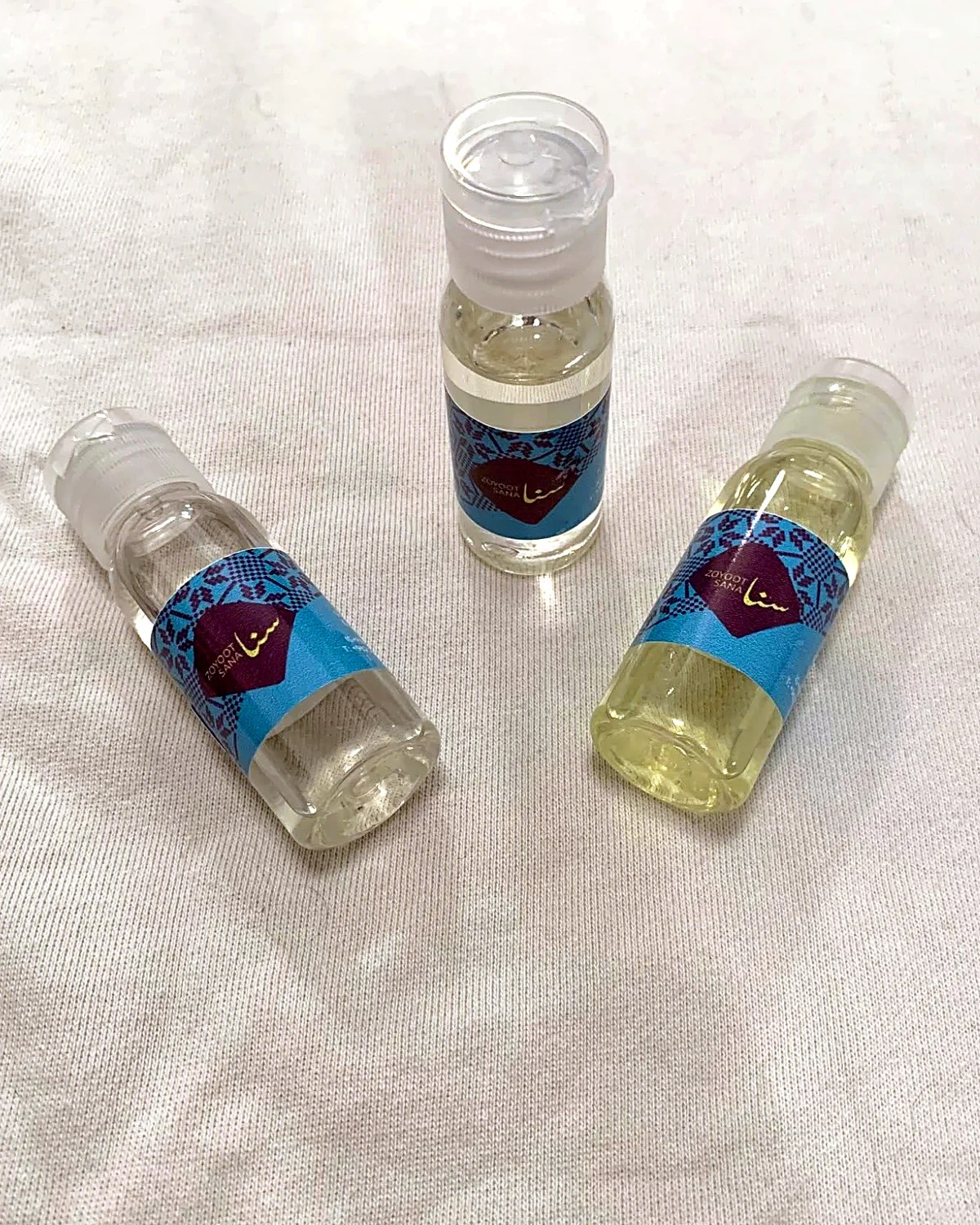
The overall feel is modern and personal. The identity also brings in tatreez embroidery patterns in a modern colour palette.

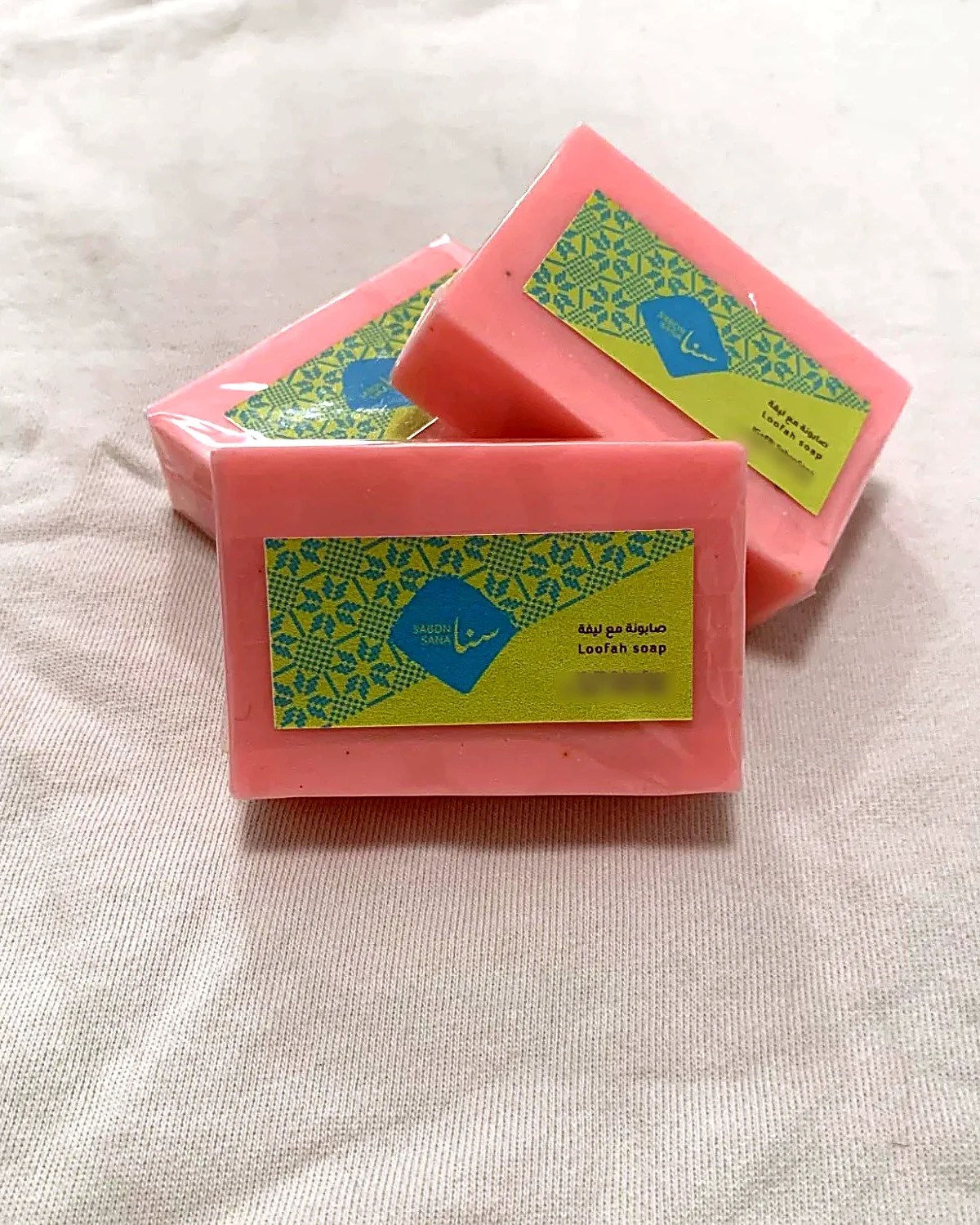

The same system carries over to Zoyoot Sana, the oils line (zoyoot is Arabic for oils): the same diamond and tatreez, with the colours swapped from one label to the next.