Agency: from6
Client: amigo
Project Type: Brand Identity
An express drinks store needed a name that feels like a friend and a mark that still says premium.
The store
amigo is an express digital drinks store. The concept is a personalised selection drawn from a wide range of premium and budget drinks, so every customer finds something that suits their taste and their budget.

The logo
Amigo is Spanish for friend, and the name sets the tone: a store that knows what you like. In the logo, GO is picked out larger and bolder, for the on-the-go spirit of the service.
Inside the O sits the shape of a wine glass, a small detail that gives the brand its sense of premium quality. The deep wine red carries across the delivery box, the carton, the bottle label and the shopping bag.
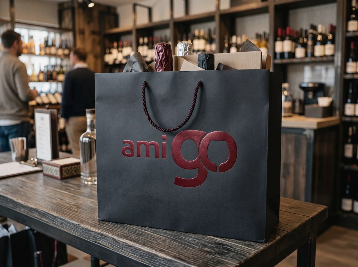

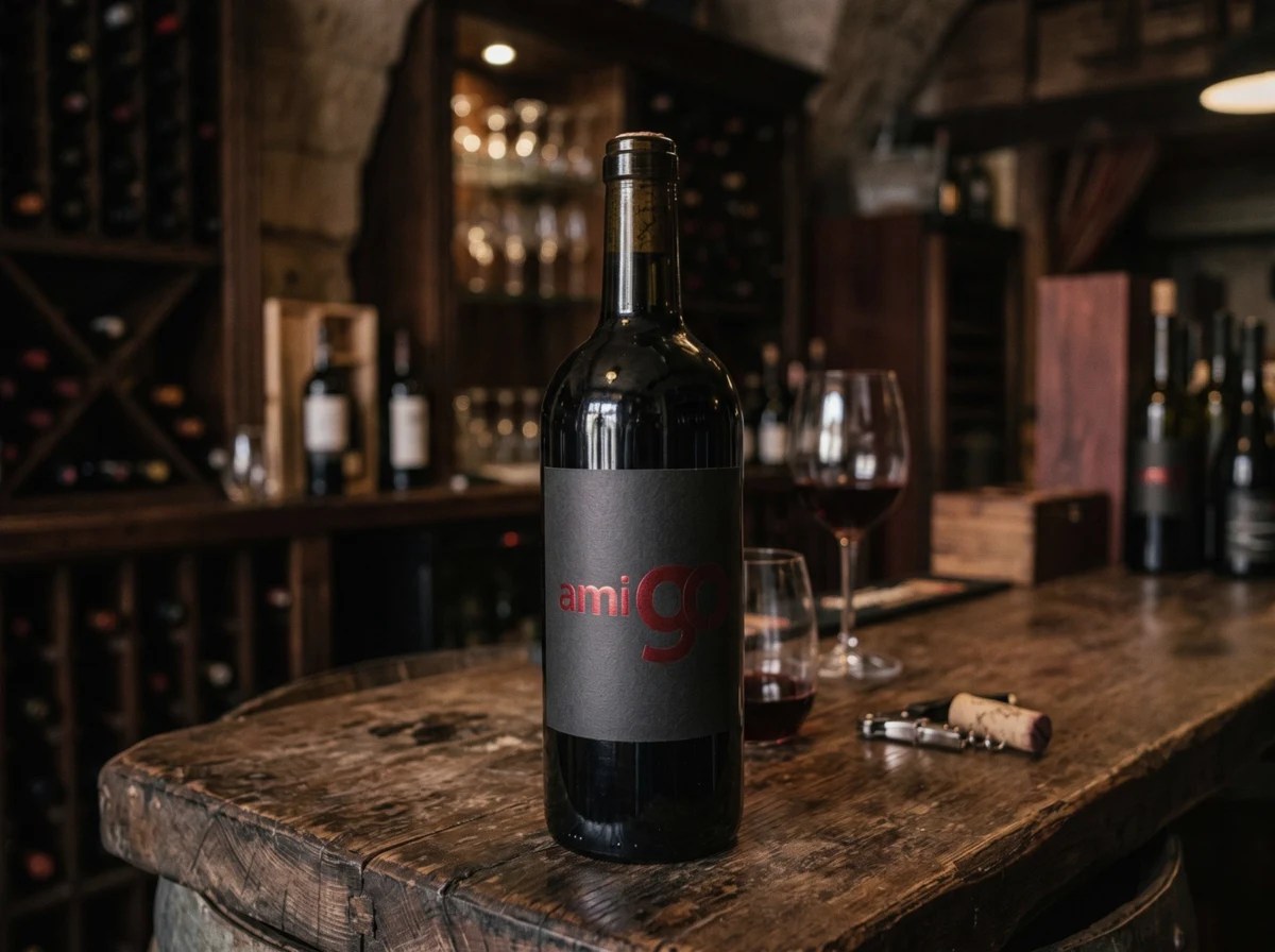
Brand application visuals.